Andy Turner Orthodontics
Logo • Branding Identity
Client
Andy Turner Orthodontics
Year
2022
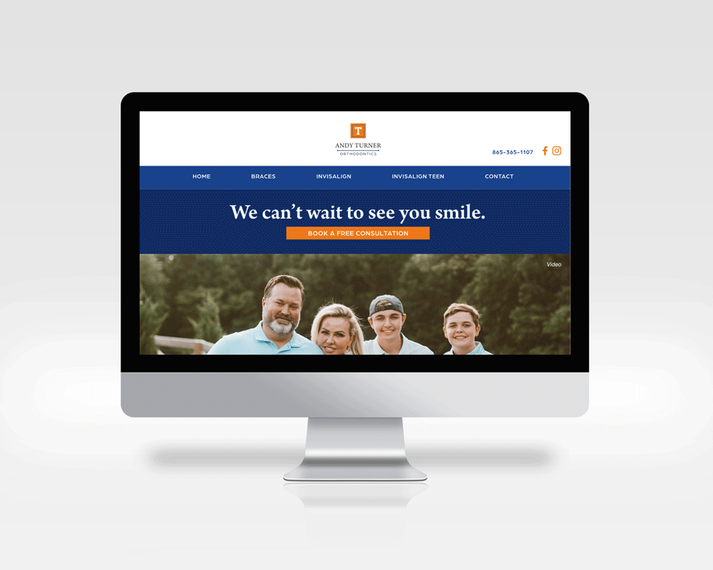
Andy Turner Orthodontics is an orthodontic service located in Knoxville, TN that provides services for people who are looking for braces, Invisalign care, and Invisalign care for Teens. For this project, I and another designer from my team were tasked to design a logo, create a brand identity, and website as a team. From the beginning, the client was looking for a brand and logo that was inspired by The University of Tennessee while adding their own personality to their brand. The client was also really fond of the gingham pattern and requested that the pattern was to be included in the brand.
The Process:
Client Call > Logo concepts >Mood boards > Color Palette > Typography > Website
Logo Explorations
For the first round of logo concepts, the client was open to incorporating a tooth within the practice logo while also including the “T” (for Turner) as the main focus. We also used Sans serif fonts mainly in the first round to create a sleek and clean design. For the second round of logos, the client decided not to incorporate the tooth in the logo but rather, make the “T” the main logo mark. We also experimented with serif fonts and Sans serif fonts as a combination to create a classic yet modern approach to the logo. The client ended up choosing option 1 and from there we started with the mood board exploration.


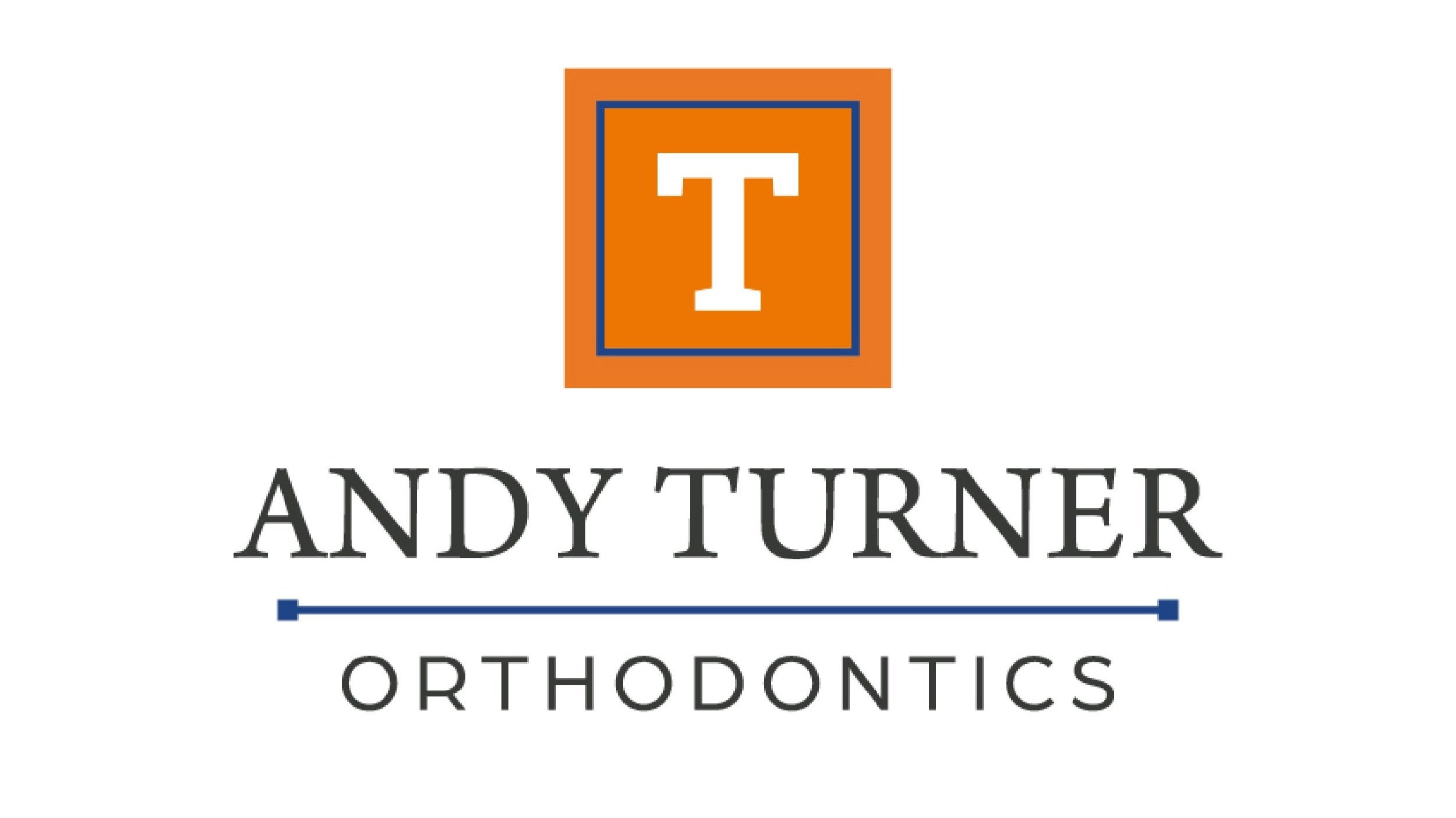
Finalized Logo
Mood Boards
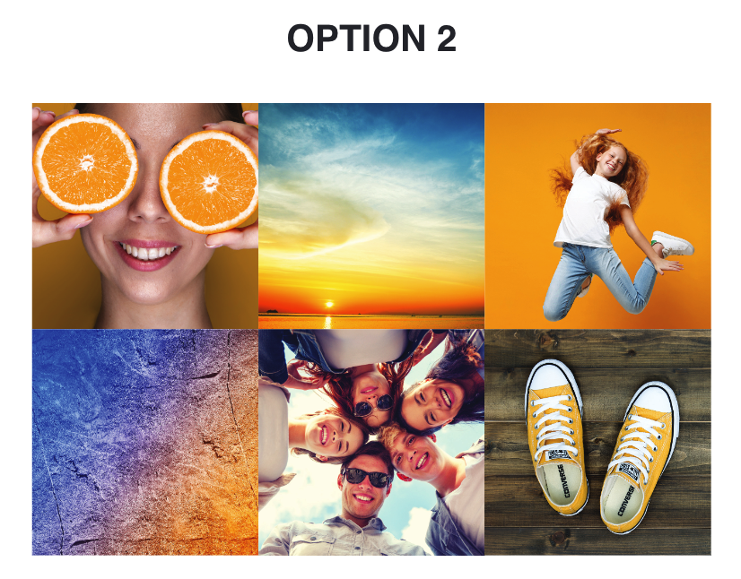
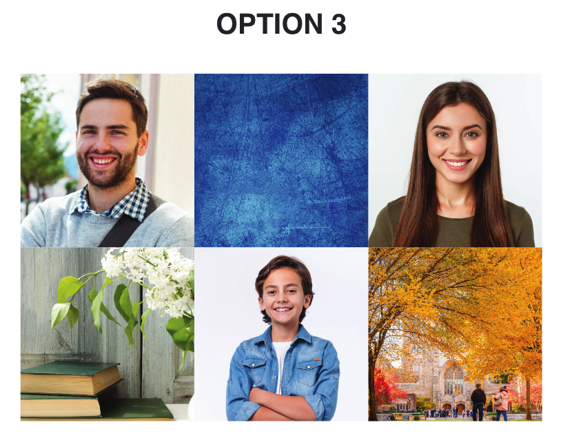
We created three mood board explorations to expand upon the look and feel of the overall brand. Option 1 is more calm and serene that focuses on family and the gingham pattern that was initially requested by the client. Option 2 is a more fun, youthful, and vibrant feel and lastly, the 3rd option’s theme focuses more on the conservative and university aspects of the area around Andy Turner Orthodontics in The University of Tennessee area. The client ended up choosing option 1.

Color Palette

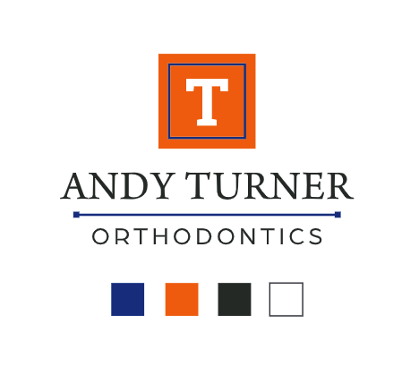
For the color guide, We expanded on the colors of the logo by including three additional color options for the rest of the brand. The client choose option 1 as their main color palette.
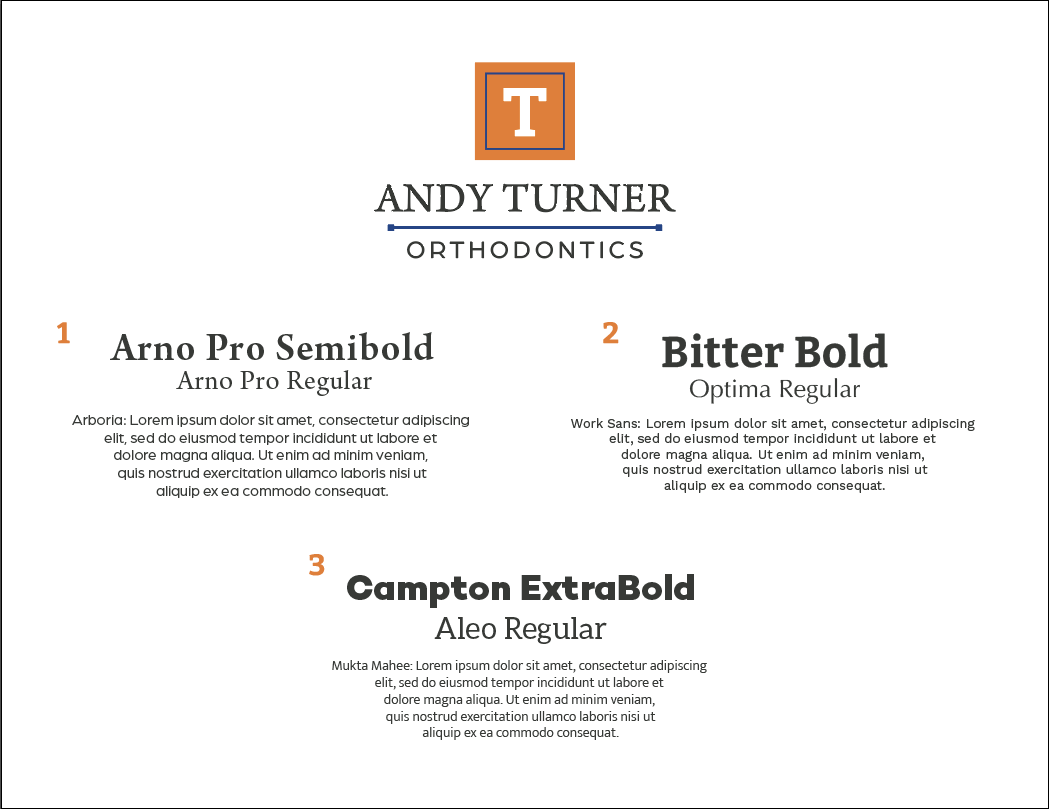
Typography